Gin Pao
Based on my research on a contemporary Graphic Designer, I was instructed to propose a simple design based off that designer and their work. The designer I chose was Sharon Werner and a brand she worked with Mr. Mak’s Gin Bao. From my research, I decided to brand a on-the-go powder version of Gin Bao called Gin Pao (like powder).
-
Procreate, Illustrator, Photoshop
-
1 month, August-September 2023
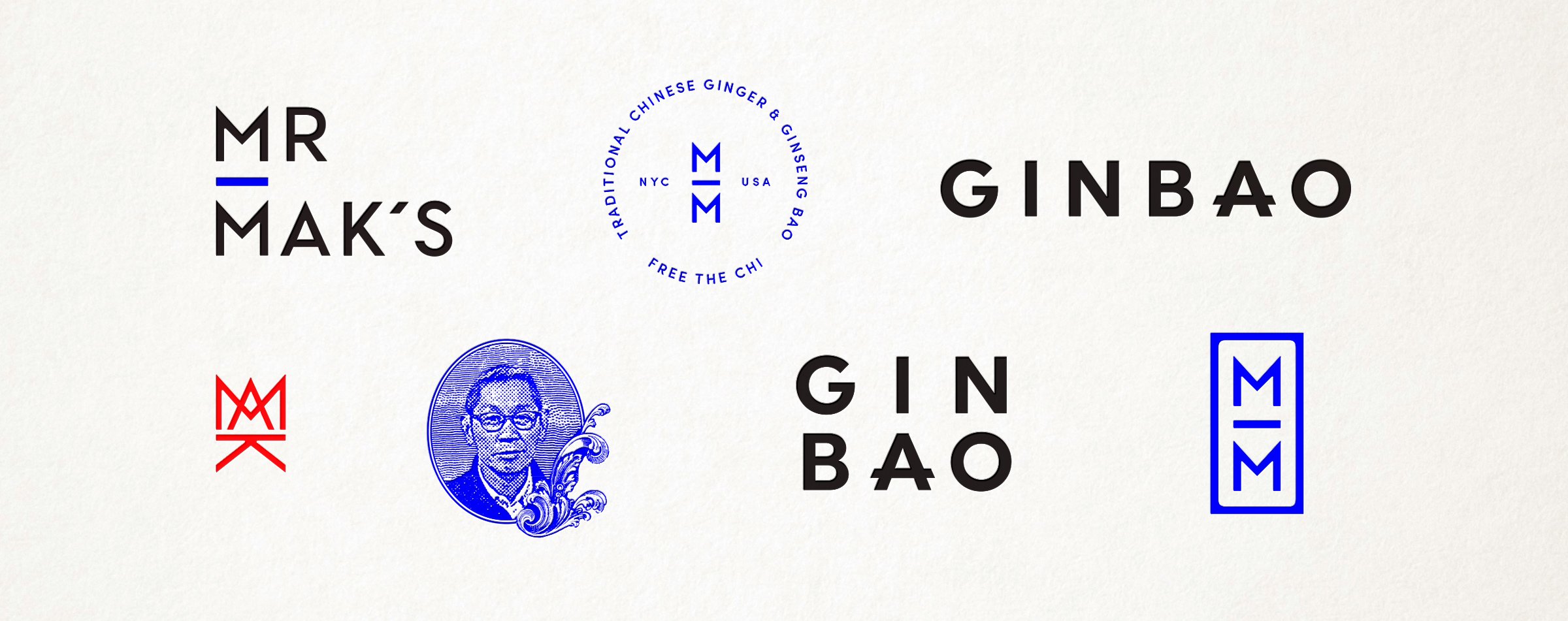
About Mr. Mak’s
“For centuries, ginger bao (broth) has simmered in kettles across Asia. It’s the base for nearly half of Traditional Chinese wellness drinks, but it’s never been bottled…until now. Mr. Mak’s, a New York-based startup, is introducing this intensely spicy drink to American consumers. Organic, gluten-free, and low in sugar, Mr. Mak’s Ginbao supports healthy digestion and a strong immune system. We developed a comprehensive brand identity for the launch product (Mr. Mak’s Ginbao) as well as for the company (Mr. Mak’s).”

Werner’s Take
“Our label design for Mr. Mak’s Ginbao is partially inspired by the tangram―another Chinese invention that has made its way into the western world―with a dose of Qing Dynasty meridian charts and a nod to vintage Chinese medical packaging. This mashup of old and new, modern and traditional, and Asian & Western plays out across the entire brand.”
My take.
I took inspiration from Mr. Mak’s flavor Queen Bee which is the Ginger + Ginseng with Honey. I wanted to keep the the geometrics of the Chinese tangram while playing with the honey motif. I decided to stray away from the original color palette of the bottle flavor because I wanted it to be seen as a separate product with hints of the same brand.